Behind the Cover: Whitechapel - Kin
- Aug 31, 2021
- 16 min read
Unmasking the layers entrenched within the pointilistic shades of blue.

Words by Luis (@luis.hoa):
In a contemporary, accelerated world of self-destructive overstimulation and overwhelming responsibility, one tends to overlook the true significance of genuine media. Music becomes background noise or merely a soundtrack to the long commutes to and from work, removing the organic nature of this otherwise spiritual experience. This brings forth a need to find time to sit back and engage, even if only for a few minutes a day, to truly let it resonate in ways that perhaps can help one find a deeper understanding of life and the unique circumstances it finds us in. There's more than meets the eye to what one could consider "simple", and if we allow for it to breathe as a canvas, new layers begin to unfold. Knoxville, Tennessee's Whitechapel understand this well and as such have grown to be intentional about every aspect of their comprehensive release cycles. In the case of today's announcement of new album Kin, the accompanying arts are capable of swallowing you whole as the band's trailblazing deathcore rips through in unison.
Arriving on October 29th via the always consistent Metal Blade Records, Kin marks the largest audiovisual departure from anything in the band's 15 year trajectory. Sonically, it finds the deathcore unit exploring more a more seamless blend of vocal alternation while letting melody take the forefront on a frequent basis. Artistically, it sports a front cover of pointilism wonder, crafted by multifaceted artists Jillian Savage, partner of guitarist Ben Savage. What appears to be two ambiguous beings staring at each other as wave-like energies flow throughout them is much more, as you'll come to learn today. Every dot and every maniacal detail was meticulously placed to evoke the same cathartic feelings of the Kin's prevalent themes. As the saying goes, there's a method to the madness and we're only a conduit to a full-length composition that astounds in more ways than one.
We go Behind the Cover of Kin with Ben Savage and fine artist Jillian Savage to dissect the month-long cover creation, the hidden meaning among it, the importance of artistic distinction in metal, and where Kin stands as a crucial entry in this new era for Whitechapel:
Ben, Whitechapel has worked with a variety of artists across the band’s discography, like Branca Studio for ‘The Valley’ (2019), Colin and Aaron Marsh on ‘Mark of the Blade’ (2016) and ‘Endless War’ (2014), and Colin Marks on ‘This Is Exile’ (2008) to name a few. For ‘Kin’, you brought your talented partner Jillian on board for visuals. How did that all come about?
Ben: We really needed a visual with psychedelic elements for the album, which I feel can only be brought about with paints, acrylics, and canvas.
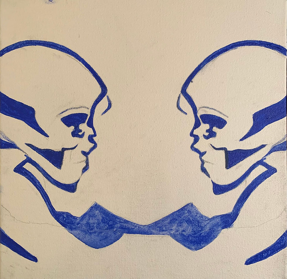
Jillian: Yeah, they contacted a couple of different artists before this. None of them felt like they could do it or felt they were going to take a lot longer. It just wasn’t panning out with other artists.
Ben: We tried reaching out to other artists, like Branca, who had a go at it. His style is more like clip art. He has a great eye for finding different clips and putting them together to make a timeless and amazing piece. We had an idea in our head but we opted not to be sending ideas back and forth through email.
Jillian: I just told him, “I could try.”
Ben: Yeah, so Jill just had a go at it. It was a great idea because she’s my favorite artist. We had the idea and so, we were able to do this one on one. She worked very hard on it. It took about 8 hours a day for a month. That’s really how it came about. I knew Jill could do it. She has a Bachelor of Fine Arts degree from the University of Tennessee. In drawing, right?
Jillian: Yeah, drawing. I have a couple of years under my belt with the arts.
Ben: She knew what to do as far as what it would take to make the painting look good. There’s different styles of paint, like the shiny and charcoal paints, stuff that you wouldn’t notice at first glance. In the right glare or if you get it printed, the paints look different.
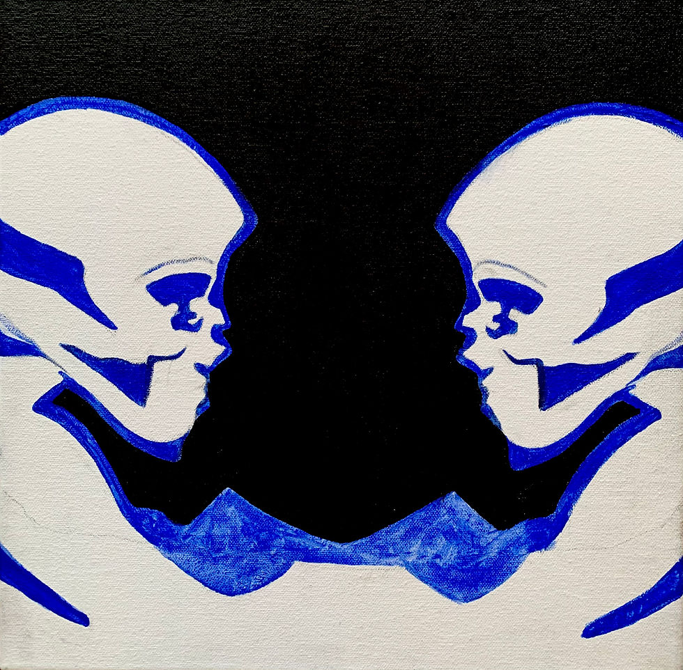
Jillian: Different mediums, yeah. They scan differently. We use a CRUSE art scanner at this local place in Nashville called Chromatics. It’s the same scanner that the Smithsonian and NASA use or whatever so I just knew they could get the job done and transcribe it well to digital.
There’s a certain quality that can sometimes get lost when you digitize an organic painting, but it appears a lot of that was preserved for ‘Kin’. That’s really why we encourage folks to pick up the physical copies of records, especially when bands do the glossy finished and cool lenticular covers and whatnot. Going back to the record, Jillian, how was illustrating for Whitechapel distinct to your personal works, especially with band and merch artwork not being among your typical lines of work? It’s quite unique to what one would expect of Whitechapel and a metal cover in general.
Jillian: It was different in that Ben had a very specific idea and I transcribed that idea onto canvas. It was very important for me to bring the discussion of fine art back into music. Back in the day, King Crimson, Tool, and all these bands had this really distinct look to them. There are certain things that you can do with Photoshop that you can’t do with paint, but I wanted to prove that there are certain things that you could do with paint that you cannot do with Photoshop, so that was very important to me. This is pointillism, of course, so my influences here were Alex Grey, Yayoi Kusama, and Salvador Dalí. I wanted to bring a surreal element to it with the preciseness of Dalí but with the madness method of Yayoi, if that makes any sense.

I just really honed in on it and I knew it was very important to Ben. I love Ben and I love the band and I love the new album, so it was very important to me to create an artwork that reflected the amount of time and effort that they put into this album, which was a lot. I wanted that process to be reflected in the art.
I’m looking at the cover now and by zooming in, I think it’s clear you’ve done it. It’s neat to see how this all coalesced. ‘Kin’ as an album title of course has certain connotations, like camaraderie, warmness, honesty, family and friendships, which is well timed with Whitechapel celebrating 15 years as a band. Visually, when you were exchanging ideas with Jillian for what became the album cover, what did you look to achieve?
Ben: We wanted a strong image that was striking, something that you could draw out in your mind really fast when you hear of the record.
Jillian: Yeah, we really wanted something that was striking, something that had a lot more detail when you looked deeper into it.
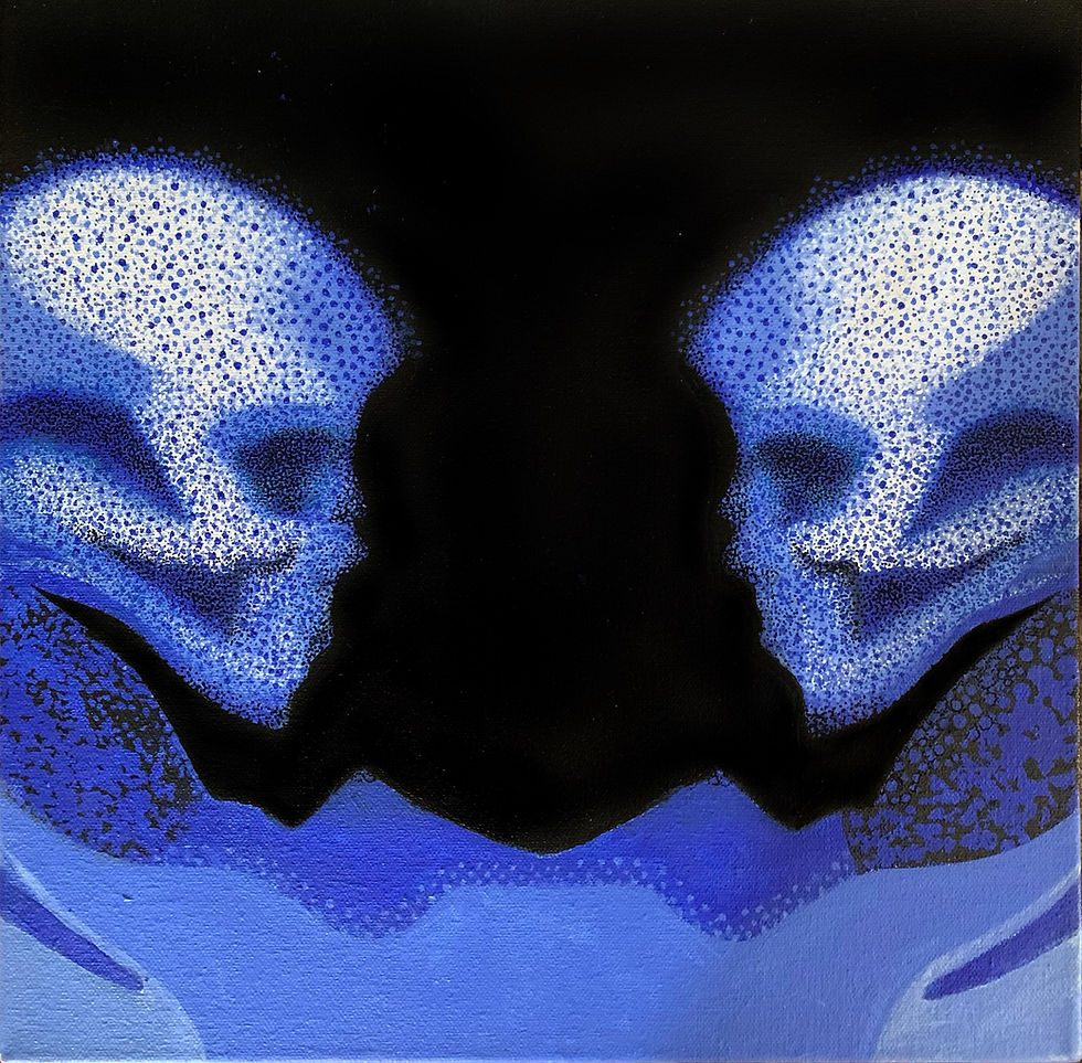
Ben: But mainly, we wanted it to look good on a backdrop for when we go on tour. For ‘The Valley’, I just sent Branca a rough sketch of an eye and a valley, just something simple like that. He did his thing and came out with an amazing piece.
Jillian: You kind of did the same for this one.
Ben: Yeah, we did a similar thing for this one. This time though, I didn’t really draw it out. I just scoured the internet for a strong reference image. Once I found that, I took it over to Photoshop and manipulated it, which Jill then took and interpreted. All of my stuff is very bare bones and elementary, which is why I rely on artists that are more scholared on the subject matter to bring these ideas to fruition.
Hence why they’re such an important part of a comprehensive release cycle. Touching a bit on the connotations of ‘Kin’ as a term, where would you say that the art speaks to the concepts and themes that you elaborate upon on the record?
Ben: It flows in and out of reality and fantasy, the reality being about a mental illness and self-division caused by trauma. You create this shadow self from the trauma, created from the story Phil told on ‘The Valley’. That’s more of the reality of the situation. When it starts getting into the fantasy component, it starts talking about the inner battles and these battles being two two different people and battling. As you can see on the album art, they’re both the same person and they’re connected by a sort of cosmic, stardust matter. They’re the same person, the same being, but it’s a battle that’s happening within them. They’re completely different when you look farther inside.
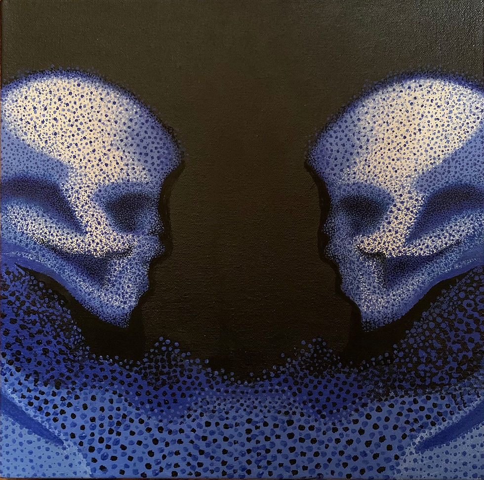
We wanted the images on the cover to look more ambiguous and indistinct. You can’t really tell if it’s a spirit or an alien. It kind of looks like a skull or a corpse. That was one of the hard parts, trying to find a face that didn’t look like a Ken doll or a toy. It’s somewhat of a standard face, which was the main reason we went with a painting. That’s how we were going to get the most real, true to our vision result rather than outsource and have someone else’s ideas on it. Jill put her vision all over the painting, but she’s one of us.
Jillian: Have you tried turning it upside down yet? There’s like a demon figure.
Not yet, but let me give that a try.
Ben: There’s a hidden message in there too. You got the two beings and in the negative space, and if you turn it upside down, there’s an evil shadow lurking between them amidst the horns, kind of. It was cool once we came upon that. We could make it look like a sort of demonic figure lurking, which Jill helped out with a lot.
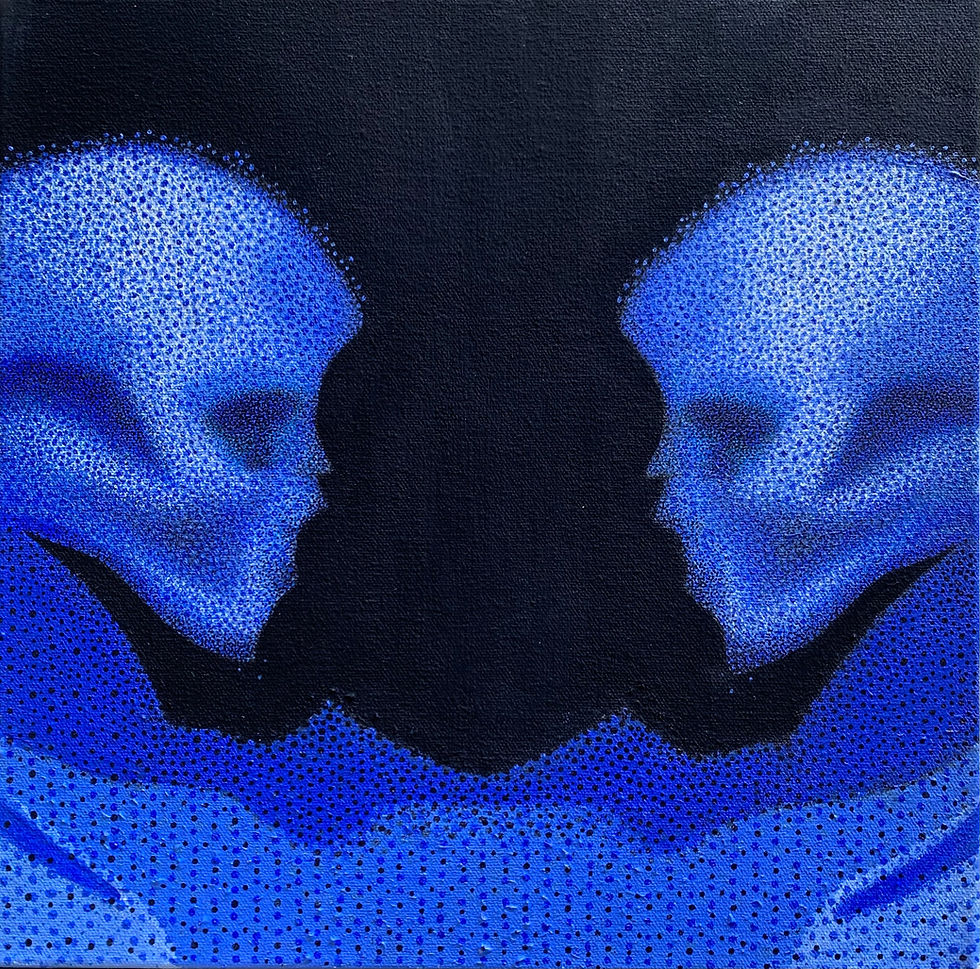
Jillian: It took a lot of fine tuning, I would say, especially with doing it in dots. All of this was done with layers and layers and layers of dots. You would lose things in it, so I had to bring it back. I’d accidentally go too far, so I’d bring it back again. I had to make it look like it faded into the background, as if it were pixelating away. It took a lot of work, but I really enjoyed it, despite the frustrating parts.
You said 8 hours a day for about a month, right?
Jillian: My job as a makeup artist would come in and out after quarantine. We would have slow months and busy months, and when I painted the cover, it just happened to be a very slow month, so I was able to dedicate my time to it. I don’t think I could’ve balanced that work life juggle doing the cover. It was important, we had a deadline, and we got it done.

It was perfect timing. Ben, you mention the art is going to be expanded upon via the live stage once that inevitably becomes a thing.
Ben: Yeah, we definitely have some stage setups that we’re working with to best use the album art. We’re also using our new logo too, the one we introduced in ‘The Valley’, specifically on ‘When A Demon Defiles A Witch’, those two intersecting pentacles. That’s also expanded upon on this new one. We’ll implement the new logo, the new look, and of course, the new color.
That sounds like something to look forward to on tour! Jillian, you touched on bringing fine art back into music earlier. As mentioned, ‘Kin’ is quite distinct to the conventionalities of the genre and takes a unique path towards its visual identity. Unless you’re familiar with Whitechapel as it is, I don’t think you’d be able to tell what kind of music to expect from the cover if you found it on a record store shelf. Would you say that was the intention, to garner curiosity through the arts and bring out a new face in Whitechapel as they evolve into a different era?
Jillian: I think they’re transitioning into a new phase of music. They’re all learning together and growing together and they’re all progressing in their musical tastes, playing, and writing. To go along with that theme, you need visual art to represent that. This is a big change because this album is a big change. I think it’s the best album they’re going to put out. I think it’s wonderful to be honest, which is my unbiased opinion. I really enjoy it.
Phil has been exploring more clean vocals and has been opening up to the fanbase, talking about his past and what it means to him. It’s very vulnerable. It’s raw and touches more on the spiritual aspect of things. The art connected better than if we were to use the traditional blood and gore album art.

Ben: Nailed it. As a band, you don’t want to think linear or short sighted in your career. You want to think about the next 10 years, you want to extend that as far as you can. Some bands can pull off doing the same thing for years, but that’s just not in our nature. It’s hard enough to write a song, but you have to be stoked on it.
Jillian: The thing about it is that you guys were kids when you started the band. You were like 18 years old, so your tastes have grown. You’re grown as people and you’ve grown up together. You were a kid.
Ben: Exactly! We want to try new things and we don’t want to get bored, so it’s kind of a necessity for us to explore every facet of what we can do.
Definitely, change is inevitable. Life was different and priorities were different, and as you grow as musicians and people, the music evolves with it. ‘The Valley’ was the biggest sonic departure, so to speak, and ‘Kin’ appears to take the next step towards a new and expanded direction. Bands can sometimes get into a fix where they remain stagnant because they’re scared to alienate a definitive sound that perhaps may have contributed to popularity. Would you say Whitechapel is the contrast to that, as if to please your own creative ambitions and build upon your growth as musicians despite what fans may have come to expect from you?
Ben: I can trace it as far back as the ‘self-titled’ (2012) album, where we started delving less into heavy blast beats all the way through and instead explored the use of slower rhythms, especially with slowing down our strumming. Doing that led into this whole other world where we could be more melodic. When we wrote the song ‘Bring Me Home’, that was the pivot to when we started singing and getting more into mood and atmosphere. We got more confident with ‘Mark of the Blade’ and once we did ‘The Valley’, the floodgates broke. We went all out with ‘Kin’. Each step along the way, you learn something and you just try to grow while honoring the best.

The great thing about this new direction is how well it has been resonating with listeners, despite it being a departure. It’s accessible and inviting and with the cover art of ‘Kin’, it allows for a greater sense of connection and open interpretation. For example, prior to this conversation, I had my own interpretation of the cover, especially with the connotations associated with kin as a term. Coming into this record, where do you feel Whitechapel is now compared to when this all began on the 2006 demo?
Ben: We definitely have more strategy involved in each decision that is made whereas when we started out, we had no idea what we were doing. We were just grinding away. We were just grinders back then. We were hungry, but now, we’re more strategic. We’re still hungry, but now we’re more refined and strategic. We’ve made every mistake in the book along the way.
Jillian: It’s important to you guys now to have a hand in the creative process of everything that you’re doing because this album has taken you all so long and you've worked together so hard on it. Instead of handing it off to somebody for a music video or the art, you wanted a hand in everything. You wanted to touch everything that was happening, and you did that.
Ben: No one’s going to care about your music and your art more than you, so you just can’t just rely on someone else who says they’re really into it, but at the end of the day, they might just want the paycheck. It’s hard, but you have to find it within yourself and work at it. If you come up with 100 ideas and only 2 of them are good, those 2 ideas might be the key to unlocking something special.
Absolutely, and it’s really about learning through trials and tribulations. You have to hit at different elements of creative expression and challenge yourself until you’ve found something that fits. Jumping back into the art, color palette is critical and though it is sometimes dismissed as a mere aesthetic preference, it’s integral to the messaging here. It carries the tone for ‘Kin’ and as Ben mentions, it will be expanded upon during shows. What drove the use of the varying blue hues as a conduit for the album’s themes?
Jillian: The last album was red. Before they even came up with the concept of ‘Kin’ or even thought about making a new album, they were thinking about doing a trilogy. The color blue is the most rare color on earth. In nature, it’s the most rare color. Blue is very striking. I wanted to go with a monochromatic color scheme like the last album to try and continue that theme. It was an ultramarine blue, white, black, and a hint of cobalt in there.

Ben thought about making it purple, but we opted for blue. Little did I know that the printing process of blue was the hardest. We found out the hard way. When you scan in the image, the RGB has to be converted to CMYK, so it kind of alters the colors. When we got the images back, we were like, “Uh, is that how it’s going to look on the album?” When it prints, it’s going to look very close to the original.
Ben: The original was painted on a 12x12 canvas, so like vinyl. If you have the album on vinyl, you’re pretty much holding the same size of the original painting.
Jillian: Yeah, and it was very hard to make those faces completely symmetrical by hand. It felt easier to do it in a more medium format so that I could see every little dot I had room to do in order to bring out the detail. I’m also not so overwhelmed to get it done in a month. It’s super concise. I liked it.
If that’s not a good enough reason for people to pick up the physical copy, I don’t know what is. There are also those neat vinyl variants that make great use of the blue as well. In a time where our fast paced lifestyles came to a temporary halt because of the pandemic, how important do you feel that it is for music and art to spark a genuine reaction, whether that be through an analytical lens or a more general, surface level enthusiasm? I ask because a great deal of fans will be introduced to Jillian’s work and hopefully be more inclined to explore beyond the confines of metal art.
Jillian: So important! The cover also draws from art history references, which is what I was trying to do, like George Seurat. There's no limit, art can be anything.
Ben: Like I said earlier about the strategic approach, you have to think about what you’re putting out in the world. Don’t just put it out for the sake of putting it out. Think about it for a bit. That’s what we’ve come to realize over the years. It’s better to sit on it and if it’s still good a couple of months later, then it’s probably a good idea.
Jillian: This is an album you’re going to want to hold in your hand. It’s like having a print of the art in your hand. You can get really close to it, unlike some digital images where you can only go so far. Back in the day when we didn’t have streaming services or anything, we had to buy the albums. It was a huge deal. We’d go to the record store, buy our favorite albums, dissect it, read it from cover to cover, and listen to it back and forth until we knew it by heart. ‘Kin’ is one of these types of albums.
Ben: You could see that each dot has its own personality. It wasn’t spray painted or anything.

Jillian: It’s all hand poked.
Ben: Each one has little grains in it. It’s really cool to see up close.
It’s kind of like a dotted equaliser or soundwave of sorts where you could see all these particles flowing. It’s going to be neat to see that on stage.
Ben: That was the goal. We wanted to get the highest image quality possible, so that’s why we took it to Chromatics in Nashville and used their CRUSE scanners. Those scanners are like million dollar scanners used by the Smithsonian to print stuff like the constitution and stuff of that sort. We happen to live in a big city where we had that opportunity, thankfully.
‘Kin’ as a whole is something special, for sure. Though music illustration isn’t part of your day to day work, is it something you perhaps see yourself doing down the line, Jillian?
Jillian: Yes, I would love to. I had so much fun working on this. Like I said, there were definitely struggles, but the process of working through it was really cathartic. As an artist, it’s one of the only things I’ve ever been able to do really really well in my life. I’m art all the way through. I’m so right brained. If I focus on something like that, I think that I can do anything with it.
As you were saying about the world coming to a halt because of the pandemic, it’s perfect for this kind of project to be honest. I was hit by a car in September of last year. I was just walking my dog. I had a head injury and everything, I’m already ADD and I had like 16 staples in my head, so I was recovering from that as well. For some reason, it just clicked and I was able to focus on my creative process for art for the first time in a long time.

Ben: That’s really the one thing you have control over, your music and the way you express yourself.
Jillian: To be honest, I had no expectation of them choosing my art. There are so many members of the band and they all have their specific vision, as they should be. They’re all picky of what goes on their album, which I understood. I just gave it a try with no expectation of them choosing it. It’s hard to show progress pics to non artists because non artists can’t visualize the end result. They were like, “We’re excited to see it when it’s done.” I was like, “Yeah, me too.”
Painting the cover served as therapy, in a sense.
Jillian: Definitely, and as you know, I went to art school. I do a lot of surreal painting, a lot of abstract. I do basically everything because in art school, you have to be proficient at everything to graduate. Painting the cover truly helped, yes.
Ben: If you look up Yayoi Kusama, that’s her therapy. She paints entire rooms with dots. She has to paint. If not, she’ll likely kill herself because she has a rare condition where she has to be doing something. Dots are her things.
Jillian: She checks herself into a mental institution and lives there, but then goes to her studio space during the day, works on her art, then comes back at night. She’s a great artist. She has a very “method to the madness” process. That was important in this cover, just to reflect what that album is about.
I’m very much familiar with her work and have seen her ‘Infinity Room’ exhibit at The Broad here in Los Angeles countless times, Mesmerizing stuff, and I can see the influence here. In closing, ‘Kin’ is now unveiled and release day is heavily awaited. Though Jillian shares this the best Whitechapel record yet, any parting thoughts here?
Ben: We’ve released the new single ‘Lost Boy’ along with a new music video. Pre-orders are up, new merch designs are up. I think fans are going to be very excited. I think they’ll be stoked. It’s a new era for Whitechapel and it feels like a big weight has been taken off our shoulders.
Kin arrives on October 29th via Metal Blade Records. Pre-order your copy HERE and stream the lead single Lost Boy below.


