
Behind the Cover: PROTEST THE HERO - Palimpsest
- Dec 11, 2020
- 12 min read
An in-depth look at one of this year's most profound album covers.

Year-end list season is underway and our second annual art feature put the spotlight on a select 30 album covers that stood at the elite. Among the top spots at #2 was today's subject, PROTEST THE HERO's Palimpsest.
Released earlier this year on June 18th, Palimpsest came forth as an achievement in progressive composition, marking an evolution in the band's otherwise noteworthy musical prowess. From the glistening guitars of opener The Migrant Mother to the orchestral serenade of Rivet, Palimpsest introduced elements to the PROTEST THE HERO formula that further cements the unit as a staple in the progressive ranks. Not only was Palimpsest musically sound, but visually as well, incorporating the work of the talented Martin Wittfooth for a cover that became one with the lyricism present. Needless to say, it was one of the best audiovisual pairings of 2020 (as noted by our list).
We go Behind the Cover of Palimpsest with guitarist Luke Hoskin and artist Martin Wittfooth to dissect the significance of the anthropomorphic sequence:
With ‘Palimpsest’ garnering high praise and ranking on multiple charts, one could say you must be incredibly proud of the reception thus far. Looking back since the release, how do you view the record now from an external perspective?
Hoskin: We had a lot of hesitation about releasing when we did. COVID had just become a real thing for a lot of people. Lockdown was a very new experience for all of us. We had already delayed the record by almost two years due to a multitude of other issues - and we all agreed we couldn't wait any longer. What we didn't anticipate was that this record would become a welcome distraction for our fans (and us!). It made the release a little more special and one that we will never forget.
Definitely. You celebrated two decades of existence last year, braving through various shifts in the music industry to become the powerhouse you are today. Where are you all as a band today compared to when this began in ‘99?
Hoskin: It's interesting what time does to a group of childhood friends such as ourselves. We literally watched each other grow-up and experience all kinds of different milestones (both musical and personal). We've been through so much together that comparing 20 years ago to today just isn't something I can actually do in my mind - it feels like separate lifetimes to me.
In many ways, we are different, but in many ways, we are still very much the same. PTH is a less full-time thing now than it used to be. But the fact that we all still care so much about what we leave behind really bonds us. We tend to make less "career oriented" decisions nowadays, which is a welcome change to how we used to do things in the early days.
It's great to hear that this is all still organic and reliant upon your camaraderie. You released the record independently, which obviously allows you all to avoid certain compromises and shortcuts to fulfill what you all felt was needed to take the band to the next level. ‘Palimpsest’ is testament to that, standing as a force on all creative ends. Where did you all find common ground in crafting what we’d consider one of your strongest records yet?
Hoskin: It feels good that it worked out that way. There were definitely times when I thought these songs wouldn't ever be finished or released. And I mean that genuinely. I actually started to wonder if they may need to be reworked and released under a different band...or stripped down and harvested for ideas for some other project. I am truly glad it didn't come to that...
I think, eventually, we found common ground in the idea of "don't release it until it's ready". We had no deadlines, and we just knew we wanted to release it the way we wanted it to be heard.
And it paid off. Let’s jump right into the visuals. From Jafar Petgar’s work on ‘Scurrilous’ (2011) to Sons of Nero’s iconic cover of ‘Fortress’ (2008), you’ve always invested deeply into the visual elements of Protest the Hero, always keeping it fresh from one album cycle to the other. How important is it for you as a band to have the visuals match that of the music?
Hoskin: It's always been important to us. We have been really lucky to work with the artistic folks we have. We grew up and idolized albums in a time when artwork was important for all musicians. Something to hold and study - and ultimately associate with the music you loved. We definitely bonded over bands we all liked who had great artwork. And it was never a conscious decision to "care" about the album art - it's just something we knew mattered.
Matching the visuals to the music is more a matter of coincidence or hindsight. They match because we can't imagine them any other way. At the time of it's release, I hated most of the artwork for 'Kezia' (2005). But I look back on it now and love it - it's exactly what it needed to be at the time.

You alternate artists for each record and ‘Palimpsest’ sports a wondrous Martin Wittfooth cover, which is of course our subject matter for today. Of the many artists available in the contemporary art scene, what drew you to Martin’s work initially?
Hoskin: I wasn't familiar with Martin's work until I was flipping through a Guitar World magazine and saw a feature for Rival Sons. The interview was about their guitarwork, but it featured the cover of 'Feral Roots' (2019). It just stood apart from anything else I had seen in years. I am still in love with that painting. I don't know why... but I am. I started looking at all of his other work and I just thought it was worth getting in contact with him - to at least ask him if he would be interested.

That was actually my introduction to his work as well. Such a vibrant cover! In working with Martin, what did you envision for 'Palimpsest'?
Hoskin: Nothing. Once Martin was on board to cook something up for 'Palimpsest' - we let him take the reins entirely. We sent him some lyrics, song concepts, and a couple demos to listen to. Our intent the whole way was to let him interpret the record on his own. We helped out a little with ideas for the song sketches for the liners notes, but the cover / back cover spread is all Martin.
One could say that cover illustrations are somewhat of a departure from your typical line of work with Rival Sons’ ‘Feral Roots’ being one of the few exceptions. Is your approach to cover illustrations at all distinct than, say, one of your university exhibitions or personal works?
Wittfooth: The paintings for album covers and for galleries and personal works are actually quite similar - the only marked difference is how I approach the composition: in the cases of both 'Palimpsest' and 'Feral Roots', we planned for the covers to stretch across the double-square format of vinyl. So, both paintings employ compositions that skew a lot of the elements toward the right and to hold a dynamic image as a square, yet to also feel balanced and complete when unfolded to their wide format. It’s a wonderful challenge that I’ve found a lot of satisfaction in exploring.

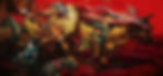
More than being just beautiful works of nature, your art conveys a message and 'Palimpsest' is no different. With details like an Uncle Sam hat wearing monkey and a bull (or cow) running through an American flag, where did you and the band find common ground in terms of interpreting their themes in your own artistic manner?
Wittfooth: The initial idea for this painting was already forming by the time that Luke/the band reached out to me to collaborate. The catalyst for the imagery in this painting was the amplified chaos of the end of the second decade of this century here in the US, and how this downward spiral into collective madness is so often on display wrapped up in hubris, symbols of pride that denote nationalistic fervor. With conversations I had with the band as the plan for the painting started coming together, we recognized a kindred concept: the album addresses historical catastrophes, mistakes, tragedies and other events that paint America in a light that is often ignored and overlooked here, in order to uphold the illusion of undeniable, blemish-free “greatness”.
‘Parade’, as the painting is titled, is symbolic in more ways than one, utilizing rich red hues, apt animal choices, and a background sequence that provides a glimpse at the migrant experience. That's of course just my interpretation. What did you two look to achieve with such a significant thematic approach?
Hoskin: Martin was able to sell us in a couple sentences with what he thought the cover should be. I still explain the cover the same way he did when someone asks me what it represents. If I may be so bold, this is a copy paste from the email he sent to Rody (Walker, vocals) and I to explain where he thought things could go:
"The overall idea here is that of the American monolith barreling forward, a stampede made up of anthropomorphic characters, all a slice of Americana in some way…There’s a point here to be made also for the compositional direction of the image: read from left-to-right, the feeling here is that of progressing through time, that things are in motion - as is the case with the song themes: nothing here is in stasis."
To me, that's Martin taking a couple elements of our record (which was still being created at the time) and absolutely nailing the direction the art should go in. He was in complete command after we read those few sentences. We trusted him fully.
Wittfooth: My main drive in composing this piece was to try and convey a kind of paradox: a harmonious and balanced image, with a close eye on a synchronized color palette, hierarchy of shapes and contrast, and a flow of movement and focal points, that is simultaneously frenzied, furious, and on the knife’s edge of falling out of control. This duality, between things in order and yet threatened to fall into chaotic oblivion, is a notion in parallel with society as I see it, and I wanted to distill that tension into this painting.
Amazing how he captured that theme so seamlessly. Martin, art is political in nature and your work has a unique approach to social commentary, specifically tackling pollution, animal abuse, and more. What role do you feel that art plays in the contemporary, pandemic-ridden world?
Wittfooth: I have always felt that art can be a mirror that reflects the human condition back at itself. If art comes from an honest place in the artist - wherein the artist makes their art un-compromised by factors that would inhibit their creative expression - it can serve as a powerful and unflinching reminder to people about our shared humanity and the themes and topics we grapple with. Or at least this is how I want to approach it. It’s a way for me of saying that I was here, this is what I saw and felt, and this is how I want to share it.
From the initial communication to putting on the final touches, how would you characterize your collaboration?
Hoskin: Easy. The guy knows what he is doing.
Wittfooth: Working with the band was a real pleasure. They gave me a lot of creative room but also some helpful notes for direction by way of having a strong and well articulated conceptual framework for the album. A lot of individual songs appear as easter eggs of a sort in the painting. We’d check in with each other throughout the process of the painting coming together and kept a nice flow of feedback and ideas going from the sketch all the way up to the finished painting.
Protest the Hero introduced a wide variety of elements on 'Palimpsest', upping the ante on their otherwise elite musical process. Did the music shape the artistic direction in any way or was it purely conceptual?
Wittfooth: It was mostly conceptual in that the songs and their titles informed some of the imagery choices, though the energy within the music itself was something that I wanted to saturate into the painting as well.
The amount of detail and layering demonstrated on the work in progress photo you previously shared is truly something to appreciate. About how long did the painting take to complete?
Wittfooth: I spent about a month on this piece. Maybe a month and a week or so, inclusive of the sketch and reference-gathering processes.
Touching on the sketches again, it seemed that the core idea for the creative direction was established early on. Did the painting undergo any changes at all?
Wittfooth: The only changes the painting underwent were some small additions of objects and a couple of color shifts to harmonize the palette more - these are standard edits with any of my paintings though. Most often as I get working on a painting new ideas form out of the process of painting itself..
Album cover parameters don’t do justice to the beauty of the painting, which of course looks best on a physical vinyl package that even comes accompanied with Matt Kidby’s artwork. Do you feel as though some of the impact of the painting is lost to listeners who opt to engage with the material via streaming services?
Hoskin: Yes and No.
Yes, because it's magnificent on a vinyl jacket. It's even more magnificent on a canvas printed by Martin himself (I know, I have one!) At the end of the day, Martin is an artist - his work isn't limited to the layout or templates we thrust upon him for our various album formats (LP, CD, Cassette, etc). His work looks best on the wall - with all its details on display.
No, because the right hand side of the painting (the front cover) is iconic in itself. I wonder if those who have never seen the other side (the back cover) could have a completely different take on what it all means.
Wittfooth: I feel like the image can live in different formats and perform a similar, though not same, function across them all. The original 'Parade' painting is quite large - seven feet wide - and in person there are a lot of qualities inherently within oil paint and my application of it that won’t be seen in any reproduced format. Then there’s the vinyl, which by its very nature is tangible - meant to be approached as a kind of haptic, sense-driven experience that asks its participant to really engage with what it is they’re about to listen to, as it requires much more of an act of “being there” to make it work than clicking a button. Hence I think there’s a real love for album artwork within this format: its size makes a vinyl cover have “presence”, and one holds it, unfolds it, explores it, as, again, there’s a tangible interaction one has with this format for it to work at all. So that’s another way by which the artwork is experienced.
Then thirdly is the little square you’ll see on Spotify or iTunes or Pandora or whatever. And though it’s much more diminutive it’s a portable and quick way by which someone might get engaged with the art. I’ve often found myself hearing a song that might come on somewhat randomly (inside a calculated playlist on Spotify, for instance), and been compelled to go look at the album artwork. And that’s a doorway for me to find more of that artist’s or designer’s work, which I otherwise wouldn’t have been exposed to. So this is all to say that I appreciate all the ways by which album art is displayed - they just have a different aura about them.
It's all open to interpretation, which is the beauty of it. Protest the Hero is a band that excels visually as much as musically, bringing along listeners with intriguing album covers, merch designs, and more. That said, do you recall a time when an album cover had that effect on you and made you pick up a record?
Hoskin: So many times. We have toured with countless bands who put an emphasis on their art to back up their music. Naming just a few would be disrespectful to those I forget. But you can immediately tell when a band or artist know it's an important aspect to how they present themselves. You can tell clearly that these artists grew up fawning over the artwork and presentation of the albums they loved.
Definitely. Martin, your cover painting has the effect of introducing many to the work of Protest the Hero based on intrigue alone. Same question, do you recall a time when an album cover had that effect on you and made you pick up a record?
Wittfooth: Yes - this has happened a number of times. Most recently I think it was seeing Nils Frahm’s album, 'All Melody' (2018). Might seem like an odd choice seeing as I’m a painter and it’s a photograph of Nils seen through the window of a recording studio. But there’s something so pure about this, no pretense. A look into where the magic happens, and the way the image is framed has a kind of poetry to it that I really appreciate: we - the listener and the viewer of the album cover, are on the other side of that place, peering in through the portal.

There's power in that photograph. Unfortunately, records released during the pandemic don’t receive the usual touring support that has become an essential part of an album cycle. Though one would like to be optimistic about touring next year, you can’t help but be cautious with certain states still seeing high case rates and strict guidelines. Where do you take things from here?
Hoskin: Everyone just needs to wait and see. Doing it before it's safe would obviously be insane. I know the feeling of heading out to a live show again (as a spectator) will be very powerful. We all have an incredible feeling of belonging and celebration to look forward to.
Regardless of when it happens, we look forward to seeing ‘Palimpsest’ on the road with Martin’s art likely on the backdrop. Congratulations on what we consider an audiovisual work of art, hence the high position on our year-end list!
Hoskin: Thanks for spotlighting the important connection between visual art and music. We are honoured to be in your discussions!
Palimpsest is available now and you can stream/order your copy HERE.
